Last updated on November 27th, 2024 at 12:01 pm
I have a follow-up plot-twist story about the project, the Zero Waste San Diego (ZWSD) website I talked about in this post.
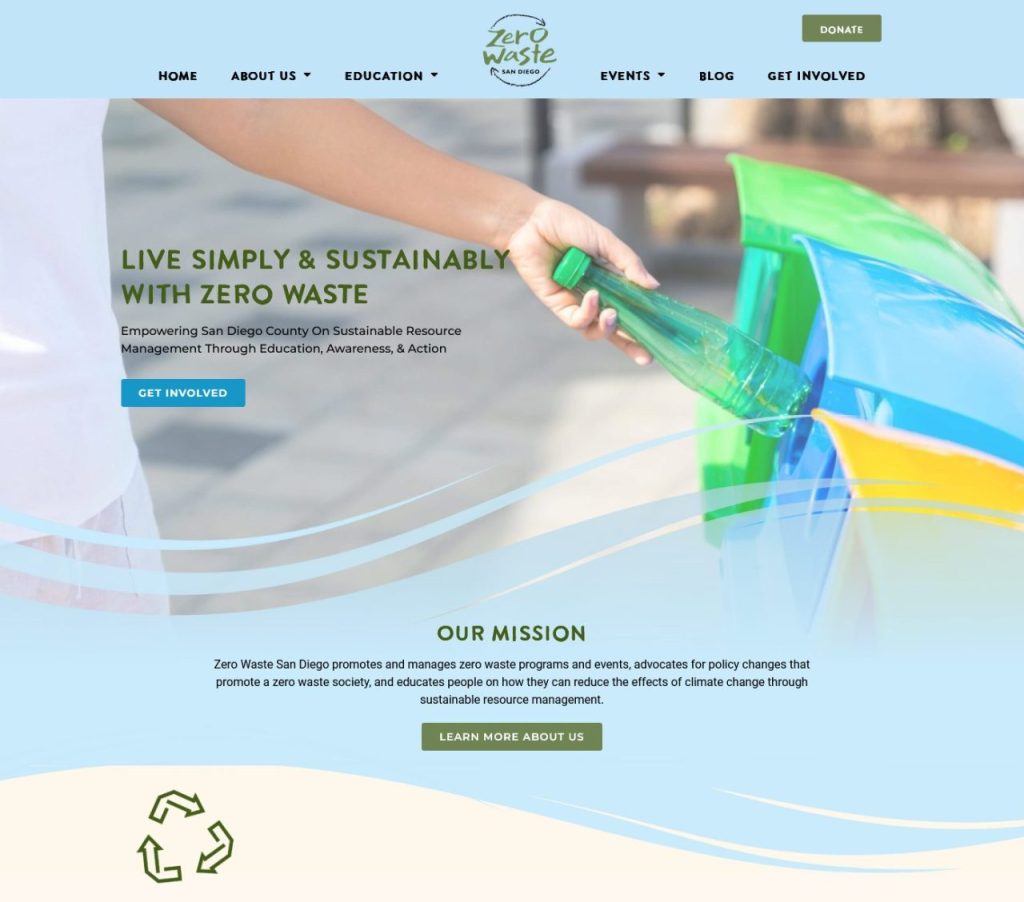
After we used the newly designed website for a while, the experience wasn’t as smooth as I wanted, nor was it for the client. The problem was that the wave section and decorative elements made it difficult to add, remove, or switch sections within the page.
I was scared of what this could lead to. The waves gotta go? Really? It’s painful just to think about it.

What were the main challenges with the homepage wave design and decorative elements?
- The wave under the hero image could not move independently as it was embedded into the background hero image. Multiple layers were created for this section to accommodate the wave for responsive design, making updates, such as adding a section between the wave and the hero image, incredibly complicated.
- Decorative elements, like a recycle icon under the wave section, were set as floating elements, making it challenging to position them properly when modifying the section. I also needed to use more than one icon to achieve a proper responsive design. This added more complexity in the backend and could easily cause confusion.
The solution was clear – I had to keep things simple by removing the wave and the floating icon, making the design consistent throughout the page.
This realization hit me hard. It’s painful to discard the work I had invested so much time and effort into. But it would be for the best moving forward.
What would be the benefits of removing the wave and floating icon?
- Updating the section content and design would be easier and faster for me and my client. Previously, I had to be the only one making changes because I knew best which layers to work on to avoid messing up the section design.
- Maintaining the page structure would become easier because there would be fewer layers, fewer elements, and fewer CSS rules to deal with. Thus, the homepage would become more practical for changes and more lightweight.
How did I fix the problems?
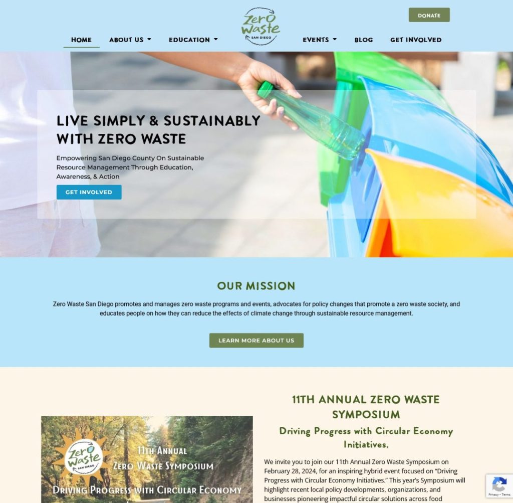
- I removed the wave from the bottom of the hero image and turned the section dividers into simple straight-cut dividers.
- I changed all other section dividers on the page to straight lines to maintain design consistency throughout the entire page.
- I turned the floating recycle icon’s position to static, where it goes with the flow of other HTML elements. This means that the icon no longer disrupts the position of other elements.

The ZWSD new homepage. View the live website.
The content and design updates on the website have been easier ever since.
This experience taught me why it’s important to prioritize simplicity over beauty, especially when the two don’t align.
No matter how much I wanted to keep the waves and the original design elements, it’s apparent that 1) they were hard to build to begin with, and 2) they were harder to update and maintain. Thus, we chose to do what’s most practical and sustainable for us and the users.
I’m curious how you’d approach this wave challenge if you were me. Reply in the comment and tell me your thoughts!